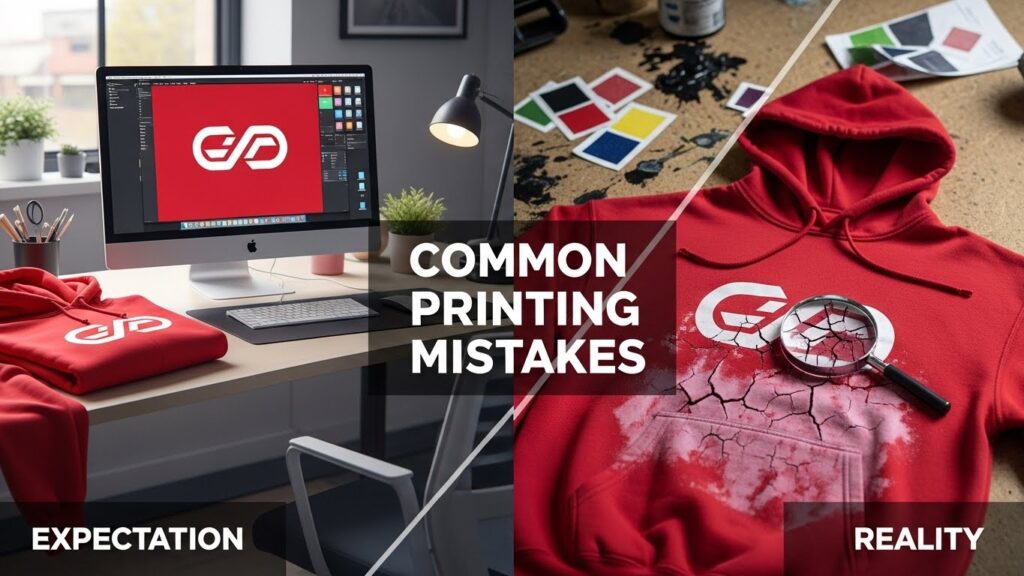
There is a specific kind of heartbreak that every apparel brand owner knows. It is the feeling you get when you unbox a shipment of 500 hoodies, expecting them to look exactly like the mockup on your screen, only to find that the “vibrant red” logo looks muddy, the print feels like a bulletproof vest, or the fine details have blurred into a pixelated mess.
In the fashion and merch industry, the gap between a digital design and a physical product is where brands live or die. Great marketing can sell the first shirt, but quality is what sells the second, third, and fourth. When the print fails, the customer does not blame the screen printer or the DTF transfer provider—they blame you.
Whether you are running a streetwear label, a corporate merch line, or a print-on-demand shop, avoiding these common printing mistakes is crucial for protecting your reputation and your bottom line.
Here at xuzpost, we dive into the biggest printing mistakes hurting brands today, from technical errors to bad strategy.
1. The “Low-Res” Trap: Garbage In, Garbage Out
This is the grandfather of all printing mistakes, yet it happens daily. Many brand owners assume that if an image looks good on an iPhone, it will look good on a t-shirt. This is rarely the case.
Screens are forgiving; they illuminate images from behind and typically display at 72 DPI (Dots Per Inch). Printing, however, is unforgiving. It relies on reflected light and requires much more data—usually at least 300 DPI.
The Mistake: Sending a low-resolution JPEG or a tiny PNG file grabbed from social media to your printer.
The Result: Fuzzy edges, pixelation (the “Minecraft effect”), and artifacts around the design. It screams “amateur.”
The Fix: Always design in high resolution. If you can, use Vector files (AI, EPS, SVG). Vectors use mathematical equations to draw lines, meaning you can scale them from the size of a business card to the size of a billboard without losing a single ounce of clarity. If you must use Raster images (like photos for DTG or DTF), ensure they are created at 300 DPI at the actual print size. Do not take a 2-inch image and stretch it to 10 inches; you are just stretching the pixels, not adding detail.
2. Ignoring the “Hand Feel” (The Sweat Patch Effect)
Have you ever worn a t-shirt where the printed area felt like a heavy piece of plastic glued to your chest? On a hot day, this creates a sweat patch because the fabric cannot breathe.
The Mistake: Designing a massive, solid block of ink without considering the texture or “hand” of the print. This is common with lower-quality screen printing (using thick Plastisol ink) or cheaper DTF (Direct to Film) transfers that are too thick.
The Result: The shirt is uncomfortable. Customers might wear it once for a photo, but it will not become their “favorite shirt” that they pull out of the laundry every week.
The Fix:
- Design with negative space: Instead of a solid black background printed on a white shirt, use the shirt’s fabric color as part of the design. Let the garment breathe through the design.
- For large prints, consider Water-Based inks or Discharge printing (which removes the dye from the fabric) for a soft feel. If using DTF, ensure your provider uses high-quality powder and proper curing techniques to keep the transfer thin and flexible.
3. The RGB vs. CMYK Heartbreak
This is where color theory meets physics. Your computer monitor displays color using light (Red, Green, Blue – RGB). It can create neon greens, electric cyans, and glowing magentas.
Printers, however, create color using pigment (Cyan, Magenta, Yellow, Black – CMYK). They cannot physically print light.
The Mistake: Designing in RGB color mode and expecting the printed shirt to match the glowing screen exactly. The Result: That electric, neon blue you loved on screen comes out as a dull, muddy navy. The vibrancy is lost, and the brand looks inconsistent.
The Fix: Always convert your design files to CMYK before finalizing them to see a more realistic representation of what will print. If you need a specific, impossible-to-miss color (like Coca-Cola Red or Tiffany Blue), you cannot rely on standard CMYK printing. You must request Pantone Matching (PMS). This tells the printer to mix a specific bucket of ink to match that exact color, rather than trying to blend CMYK to approximate it.
4. The Polyester Bleed (Dye Migration)
You decide to print crisp white logos on red performance hoodies. They look great fresh off the press. Two weeks later, you open the box, and all the white logos have turned a soft, sickly pink.
The Mistake: Ignoring “Dye Migration.” When polyester fabrics are heated (which is necessary to cure ink), the dye in the fabric turns into a gas and tries to escape. It migrates into the ink sitting on top of it—the Result: Tinted, discolored logos that look cheap and defective.
The Fix: If you are printing on polyester or 50/50 blends, you need a barrier.
- Screen Printing: Use a gray or black “blocker” base layer under the white ink.
- DTF/Transfers: Ensure you are using “sub-block” or “anti-migration” transfers designed explicitly for polyester. These have a special layer of carbon or a blocking agent that prevents the fabric dye from penetrating the graphic.
Use special ‘anti-migration’ transfers. For reliable results, check out Wise DTF Prints, which uses a special backing to stop the red dye from soaking through.
5. Improper Placement (The “Belly Print”)
Placement dictates the shirt’s vibe. A standard chest print that sits too low looks awkward, outdated, and unflattering.
The Mistake: Guessing the placement or centering the design vertically on the shirt. If you center a design mathematically on a t-shirt, it will end up on the wearer’s stomach, not their chest.
The Result: The shirt looks ill-fitting, even if the size is correct. It lacks that retail-ready polish.
The Fix: Standard chest placement is usually 3 to 4 inches down from the bottom of the collar seam. However, this varies depending on the shirt size and design.
- Pro Tip: Do not use the same print size for a Small shirt and a 3XL shirt if you can avoid it. A 10-inch-wide logo looks massive on a Small shirt but like a postage stamp on a 3XL. This is called “grading” your prints. While it costs more to set up multiple screens or files, it ensures the proportions are correct across all sizes.
6. Overlooking Seams, Zippers, and Pockets
Designers often work on a 2D template that is perfectly flat. In reality, shirts have lumps, bumps, seams, and pockets.
The Mistake: Placing a design right over a zipper, a thick seam, or a pocket without accounting for the print gap. The Result: Ink buildup (clumping) around the seam, gaps in the print, or a zipper that gets gummed up with ink. It looks messy and unintentional.
The Fix: Keep designs at least 1 inch away from seams and hems unless you are doing “all-over” printing or specialized cut-and-sew manufacturing. If you must print over a zipper or seam, use a method like water-based discharge printing or sublimation that dyes the fabric rather than sitting on top of it, though even these have limitations over thick seams.
7. The “Good Enough” File Background
You sent a PNG of your logo, but you did not realize there was a faint, almost invisible white box around it, or “noise” pixels that were not entirely erased.
The Mistake: Failing to correctly transparentize the background.
The Result: The printer prints exactly what you sent: a logo inside a weird, faint white box. Alternatively, you get “halftoning,” where the printer tries to fade the edges, resulting in a speckled, dirty look around your clean design.
The Fix: Zoom in. Way in. Check your edges. Use tools like Photoshop to ensure your transparency is 100% clean. If you are not a graphic designer, hire one to “vectorize” or clean your files. Paying $20 for a file cleanup is better than wasting $500 on ruined shirts.
8. Skipping the Wash Test
This is the step that separates the hobbyists from the professionals. A shirt might look incredible the moment it cools down, but what happens after five wash cycles?
The Mistake: Selling products without testing their durability first.
The Result: Cracking ink, peeling transfers, or fading colors after one wash. This is the fastest way to get negative reviews and returns.
The Fix: The Torture Test. Before you launch a new product or use a new printer, order a sample. Wash it inside out, then right side out, and throw it in the dryer on high heat (even if the tag says low heat, because that is what your customers will do). If the print survives the torture test, it is ready for the public. If it cracks or peels, the curing temperature or pressure during production was likely incorrect.
9. Choosing the Wrong Method for the Job
Not all printing is created equal.
- DTG (Direct-to-Garment) is fantastic for one-off, full-color photos on cotton, but it is slow and expensive for bulk production.
- Screen Printing is the gold standard for durability and bulk orders, but it is expensive for small runs with many colors.
- DTF (Direct to Film) is versatile and great for detailed logos on tricky fabrics, but it can feel heavy if the design is too large.
- Sublimation lasts forever but only works on light-colored polyester.
The Mistake: Trying to force one method to do everything. Using screen printing for a 10-color photo on 12 shirts will bankrupt you with setup fees. Using DTG on a cheap polyester shirt will result in a washed-out image—the Result: Poor margins or poor quality.
The Fix: Educate yourself on the strengths and weaknesses of each method. Match the method to the design and the fabric.
10. Neglecting the Neck Label
You printed a killer design on the front but left the manufacturer’s tag (e.g., “Gildan” or “Hanes”) on the neck.
The Mistake: Leaving the stock tag.
The Result: It breaks the illusion of a brand. It tells the customer, “I bought a cheap blank and printed on it,” rather than “I manufactured this garment.”
The Fix: Remove the tag. Print a custom neck label (pad printing or heat transfer) with your brand logo, the size, and care instructions. This small detail dramatically increases the garment’s perceived value. It transforms a commodity into a brand asset.
Conclusion: Quality is a Habit
The apparel industry is crowded. Anyone can set up a Shopify store and a print-on-demand account in an hour. However, the brands that last—the ones that build loyal followings—are the ones that obsess over the details.
They do not just sell designs; they sell a physical experience. They ensure the print feels good, the colors pop, and the logo survives the wash.
Avoiding these printing mistakes requires more time in the prep phase and a little more investment in sampling, but the payoff is a product that speaks for itself. Do not let a bad print be the reason a customer breaks up with your brand.
Frequently Asked Questions
1. What is the best file to send to a printer so it isn’t blurry?
The best file is called a Vector file. Theseusually end in .AI or .EPS. They are made of math, not dots. You can make them as big as a house, and they will never get blurry. If you use a normal picture (like a .PNG), make sure it is very large (300 DPI) and has a clear background.
2. Why does my design look bright on my laptop but dull on the shirt?
Computers use light to show color. Printers use ink. Light is always brighter than ink. To fix this, change your color mode to CMYK before you print. This shows you what the ink will really look like. If you need a specific bright color, you have to ask for “Pantone Matching.”
3. How do I stop the print from cracking in the wash?
Cracking happens when the ink is not “cooked” enough. The printer needs to heat the ink to a high temperature to make it strong. To prevent this, always order a sample first. Wash it and dry it on high heat. If it cracks, tell your printer to fix their settings. Also, tell your customers to wash their shirts inside out with cold water.